
Our process. Part 4. Brand Identity - The logo mystery.

A significant part of your new brand identity is your logo. Often confused by the brand itself. When someone approaches us, asking for a new logo, we usually pause and explain the importance of strategy in creating a brand that feels authentic first. A logo is, of course, part of that brand’s new visual identity but never works alone. The Nike Swoosh would mean absolutely nothing, without the millions of marketing dollars that cemented the mission and values of the brand in our brains. So, it’s important to understand, that a logo by itself won’t do anything for your company, no matter how cool it looks. It can however be a beautiful representation of your brand if done well and used in a consistent manner. And by consistent, we don’t mean rigid. A logo can and should be responsive and give you some flexibility to adjust to different needs and spaces. Even a big corporation (where it is a lot more important to show consistency and stay recognizable easily) usually has a stacked and long version, a sub mark or monogram, and an icon. But with lesser know companies, and in our case, a service-based company without products on a shelf, we believe we can be even less rigorous and allow our logo to show up in different expressions at different times or channels. We set out to do this rebrand to infuse a little more love and play into our work and that has us exploring how far we could push this freedom.
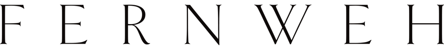
Have a look at some options below. We won't keep them all, but we do really enjoy how it all feels less earnest and serious, more expressive and personal. The craft infuses care into it, and we do believe that what comes next for sustainability needs to be lighter and hold space for joy.
And while we do that, I wanted to explain some of the logo terms in this edition of our Studio Notes for you, as there is often quite a bit of confusion around the different expressions.
The general term logo refers to all marks that represent a brand. A logotype, also often referred to as wordmarks or lettermark is a logo centered around a company name in its letters, while a logomark is a logo centered around a symbolic image or icon. And a lot of companies like Apple or Target have both. Really not that complicated.
Apart from a logo in all its iterations and forms, we often create a few key visuals or additional icons to play with when bringing the brand to life. Those can be used in decks, on collateral or swag, or on digital channels.
Let us know if you have any questions on the topic of logo vs brand. We will dive into the last section of our regenerative branding process next week, where we wrap it all up nicely in a brand guide.
Much love,
Lisa & Tim
In case you want to catch up with the previous parts of our regenerative branding process:
Fonts & Colors
Brand Identity
Visual Exploration
Strategy - Brand Personality
Strategy - Brand Personas
Strategy - Brand Narrative
Strategy – Core Messaging
Discovery & Research
Our Process